Thursday 21 May 2015

Business Cards

I had a hard time trying to figure out the design of my business card because I couldn't picture what my company would be or called.

These are the designs I came up with, I played with different fonts as you can see and I have come up with a design I am happy with but it will not be my final design because I might have a better vision of how I want my company to look.


I like this design, I have used the circle because a person I met while volunteering at an event suggested why not use the image of a moon as my name has that pronunciation, so I did experiment using the moon as a logo but felt it looked cliche so instead I decided to use a circle. I experimented with the using a half moon logo but since I was not certain of what my logo would be I discarded that idea.


I really like the design below, I think this is the look I am going to experiment further with but I am happy with the simplicity and the way I have framed it on the card. I chose orange because I wanted a bright colour and I feel that orange promotes the image of warmth and happiness which is part of my personality. I did try it with the colour black and green above which I think do look good but I feel that I will be going for a bright colour.

Friday 8 May 2015

MoFilm Bose Advert

I decided to enter the February contest on MoFilm by the Bose company.

Though I chose to do the BOSE brief, I did consider the other competitions that were running at the time which was UNILEVER and National Youth Council (NYC)

Some mind-maps and playing around with ideas. There was complications in the beginning because I had read the brief wrong, instead of creating a film for Bose Headphones I was building my story around Bose Speakers. I learned of this from the declined response on the grant money to help with production.

Harriet was very clear and detailed on the feedback for my idea and helped me steer it in the right direction I feel.

Here is a brief preview of the email:

The brand felt like many of the ideas- although creatively very strong and all captured powerful stories related to music, were not completely aligned with their creative strategy.
To clarify the brand have shared:
The theme: 'Music is my ...':
Music has the power to transform a moment. These films should be about that moment and how it gets transformed.


The moment itself is not necessarily finite. It could be about someone who likes to escape their daily grind or commute, something they are working towards or building up to and music gets them through it changes what they see and how they feel in that moment.
We want to explore this transformation via stories featuring people who 
are getting into or out of something for example To escape, focus, connect, share, create etc.
We like the idea of the switching between introverted and extroverted moments. Could be a transformation either way.
It’s not about:
The role that music plays in your life.
What music is to you.
How amazing music is.


The role of headphones:
The transformation that you experience via headphones is likely to be
introverted​ (as a result of the user experience of this particular product).
Headphones should be part of the overall experience in some form. They are a signal that a transformation occurs whichever way you choose to show it.


This a rough schedule of how I would plan the shoot, I wanted to shoot each person's story in 2 days maximum, 3 in case of problems with locations. I wanted to do it in a 3 week slot but that was not possible because the actors had other commitments but we managed to film in time for the deadline. One of the locations was my house again but it was a plan B option as the location I wanted to use was under refurbishment and I did not have enough time to find and negotiate another one.


The brief was to present a film that shows how music can transform a moment, the moment can last for a long time or be short but the emphasis was how the new Bose Soundlink headphones provided this experience.

I was really happy with my time management skills because I managed to create an idea, plan the filming times, find actors/actresses and edit all before the deadline.

My cameraman was Vlad Dimov who I knew from my dance training and he filmed all the scenes for both of the videos. My role was to direct and edit the video. I enjoyed creating commercial videos because it tested my storytelling skills. Many briefs on MoFilm require the artist to produce stories that empact the viewer in 2 minutes or less.

I submitted two videos in the end because I realised I had chosen the wrong product to represent in the video. I focused on the Bose Soundlink speakers instead of the headphones, so some damage control had to be done there, however it all worked out in the end. I cannot post the videos publicly until decisions have been finalised, the deadline for that is between 11th May-14th May so if my videos are not successful then I can post them on my blog publicly.

As editor, which was the role I wanted to mainly do, I had the chance to really improve my skills on colour grading, shot timing and sound to a quality standard.


Gina's story:

Gina's story was more relaxed, I decided to show how she would spend her day listening to the Bose Soundlink headphones. It starts out as her hanging out with her partner and friend, they get the itch to dance and decided to go out in town to let loose. They find a wide space and start dancing, and for them a good night is being able to dance and chill after. I chose this concept for Gina because it is the reality of Gina's life so it worked perfectly as she did not have act differently on camera.

Most of the lighting from this video was what was available at the time, except for the indoor scenes which I lit with redhead lights. I placed a diffuser over them to soften the light as the emotional tone of this film was happy and relaxed, so having harsh shadows would not have worked.

This is the story, there might be some changes but I have also included the rough storyboarding/shot list I did to understand how the shots would work.


Namara's story:

Namara's story had a serious tone, I decided to show her journey to success. Her scenes are more solitary and emotional, I tried to emphasis how she does what she needs to do like a 9-5 job to make sure that she can provide for herself and come home to train and dance which is her passion. The headphones allow her to shut the outside world and dance in the comfort of her own room which I tried to make it look like a stage.

Lighting for this video was hard because for the dance scene, I wanted a spotlight appearance to make it look like she is performing and that is how I hoped the audience would interpret the video.


Working for SWS Company/Tribe Arts Volunteer


I was approached by Leah Francis and Carmen Martorell who are the founders of Speak Woman Speak theatre company. I met Leah from my when I looking for volunteers to feature in my interviews for the Afro Identity documentaries. The job starts in April where I shall work till July, the dates are spread apart so it does not conflict with my university work and I am working around Yorkshire so travel is not a complication.


Their production is about telling stories that aren't commonly told especially through the woman's point of view. I had the pleasure of watching their first performance at Theatre in the Mill, Bradford, and I was able to see the preview of their rehearsals so it was amazing to see how much work they put in a week for it to be ready to be shown. I am looking forward to future performances and I am enjoying my role in their company.

She offered me the role of 'assistant producer' where I would be updating their social media page on their activities during rehearsals and performances. I would also assist their videographer, Marcus when he is filming the performances and interviews.

I accepted this role because I was excited about what I would learn on the job, and though I will not be editing but I am learning communication skills because I am normally interviewing the audiences after performances and improving my social media skills through advertising. This will feed into my personal life as part of putting yourself out in the world is through social media.

Thursday 7 May 2015

Post-Production: Film Poster

I am thinking of how to present my film, mainly the theater piece since that is what I am most proud of out of the two films.

These below aren't the final looks of the poster but I was experimenting with using pictures from the shoot. However I will try experimenting with different compositions, to see if it can still work without the image and just text. I shall be asking Graphic students and Visual Communication students since I have worked with some in the past on external projects outside of college.
I have learnt that it is not about taking what everyone thinks of your work on board and changing it but it is good to have feedback especially from those in the college environment studying different mediums, this a process which I want to improve on so I can continue to learn and improve my style of working.

I took on what Matt suggested about cropping the face instead of the full shot, and I think that it works very well, my next move I mentioned is to experiment with fonts and colours to see convey the message without the image.
Again, I have used orange/yellow as the colour for the font, trying to keep the theme visually consistent.


Post Production: Chosen Font

I experimented with different fonts to see what would suit the theme of both films, as I want to keep the visuals consistent.
I tested using both of the titles from the films to see if there some fonts would work better with a certain title.


 I narrowed it down to Carbon Block and Myriad Pro Condensed because I thought that were best. I really like the style of which the letter Y is written, it is the first letter of Yoruba. The shape of this font in my opinion highlights the quality of this tribe. In my tribe, Yoruba we are known as the warrior tribe, who are bold and brave so I feel this font stands out boldly.


The colour of the font in the image below is yellowish orange, this is because I wanted to match the set design and the main colours present in the film are orange, yellow and red compared to the other colours. I want the viewer to continue to see these bright colours throughout both films, especially in the theater piece because that is where it is most obvious.


Tuesday 5 May 2015

Post Production: Colour Grading and Adding Lights in Premiere


I watched the tutorial above to understand the basics of using Light effects in Premiere, because though I have been using the three way colour corrector, however I feel that I did not get the right effect for the overall look.

Using the lighting effects has helped to emphasize where I would want the audience to focus on, but its mainly helped with the harsh shadows in certain scenes. I have pasted some images below as examples. 

The tutorial explained how to use the main three lights provided: Directional, Spotlight & Omni.
Each serving a different purpose for different needs, I was able to watch the tutorial and after, all you can do is continue to experiment to understand the tool more.
Using this light effect has made it easier to enhance the colour from the colour gels I used on set, because the three way colour corrector and RGB curves did not give the desired effect, and masking off each area for each scene would have been too time consuming for the time I had.


Combining the three way colour corrector and light effects has a better result in my opinion.
I've mainly edited the Input, Output colours and saturation as I did not need to add colours because I used colour gels. My aim was to make sure I had the lighting colours already present so it would be more effective when I reached post production. 


Sunday 3 May 2015

Post Production: Establishing Shots

Over the weekend I decided to film some extra shots for the film, The Girl That Doesn't Speak, though I was short on time, I thought that the film really needed some establishing shots because it was set in a real location, whereas the film, Stolen Goods did not desperately need establishing shots because of its theater location.


I shot many different angles using a camera on a slider to add some motion to the shot, make it more interesting.
I think that quick shoot went well and I was happy with results, for future shoots, I understand how important establishing shots are and though I focused too much on trying to drive the narrative forward, the film fails in conveying the story clearly to the audience due to the structure of shots.

Friday 1 May 2015

Post-Production: Mistakes I Have Learnt

In the last three weeks of this project, I have been editing the two films. I started off placing the scenes in the sequence I wanted and then later cleaned up the editing.

After having a talk with Matt Burton in the AV room, he gave me some good critique of the film 'Stolen Goods' and highlighted some mistakes that I can later improve on in the future.

The films are meant to be short but now that I am in the post-production stage, due to the stress of not having a crew and not being able to find actors, I forgot to make sure that I filmed many angles of each scenes, instead I sometimes only had a mid-shot of one scene, decreasing my options in the editing stage. This could have been avoided if I had kept a log book of the shots which I started at the beginning but I was doing so much multitasking that I stopped halfway through.
I roughly kept in line with my shot list but also did not do the basic necessity of getting the required shots per scene. Getting all the required shots would mean I also have variety for dialogue allowing me to cover up and mishaps. 

The lighting in my film 'Stolen Goods' was really good in most scenes, however the scenes that took place on the sofa and in front of the wood board had harsh shadows from the actors. I learnt that this can be avoided by creating enough space between the actors and set, which I felt I did but I can see I made the set a little too squashed, not allowing enough room to light the set and actors separately.


My aim from the beginning was to keep the story focused and not fill any scenes with un-necessary fillers, however I know now that in film that is not always possible, especially when trying to show the passage of time, fillers are great tool to utilise. Instead, the main method I focused on to show the passage of time was by changing the character's outfits which works but the fillers would also have helped the pace of both films better.
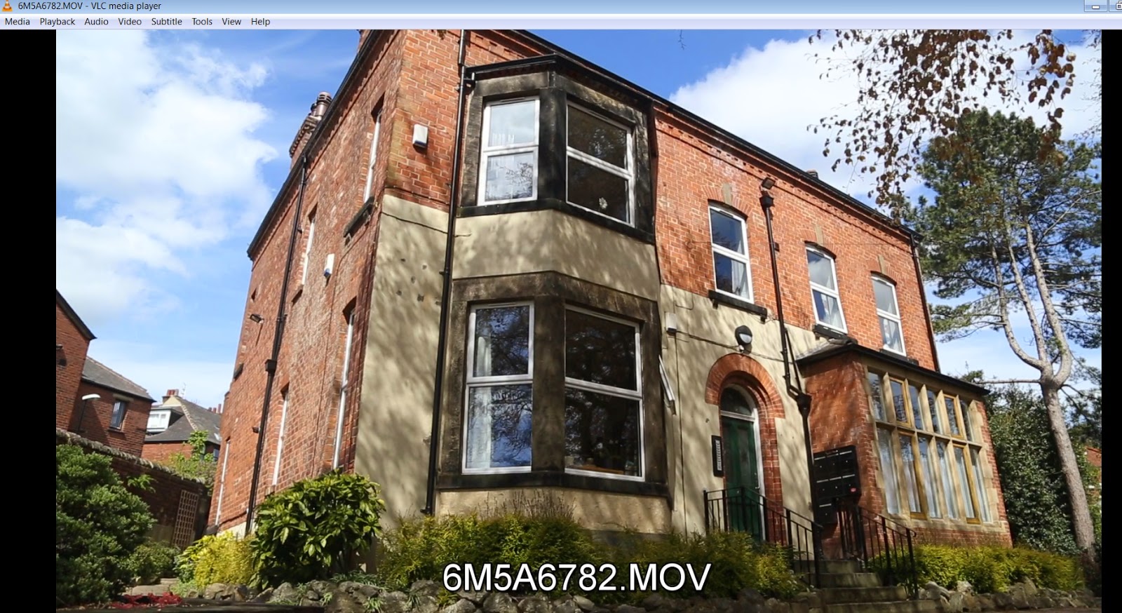


I managed to quickly shoot some filler scenes for the second film, just to give the film a better structure. If I had more time I would have done more filler scenes but then I would also need to call the actors which would not be feasible. However, for the future I understand how filler scenes help a film, and establish the story in the location or time. Since I was focused very much on telling the narrative through dialogue, it is good to get constant feedback on storyboards and shot lists to make sure that the audience can understand what you are trying to convey.


Post Production: Background Music Choices

For Stolen Goods, I have chosen the Yoruba song by legendary Yoruba musicians Kayode Fashola and Baba Ken Okulolo. These are artists that I grew up listening to when played at parties or by my parents. Yoruba music is said to be honest, because the musicians mainly talk about the life lessons they have learned, this is in line with my films as they are a different medium in which lessons are still taught.


I have contacted sound artists but I did not receive a reply, if I am able to collaborate with someone before the final year show I was going to have a music score created primarily for the film.

However for now I am going with my original back up plan which was to have Yoruba music, this is because I feel it also suits the film visually, especially the theater piece and emphasizes the style of the film. I have emailed another music student so hopefully before the end of year show I can have a music score written.