Thursday, 22 November 2012

BAF Festival Trip: 14th-16th Nov


Last week, I and my classmates visited the BAF Festival held in Bradford at the National Media Museum. It was a short 3 days packed with talks and screenings of animations, film and games.
It was a very informative 3 days that I experienced, it helped show me the different animations that students and professionals produce in the industry. The sessions I most looked forward to was watching Paranorman in 3D, Mark Shapiro's talk and Chuck Jones Centenary talk.


Talks:
Vanessa Boyce from Double Negative http://www.dneg.com/

This company's work consists of creating parts of Gotham City in the recent Batman films, worked on the buildings and other visual effects in Inception starring Leonardo DiCaprio.
I enjoyed their talk because it gave me an insight into the type of work they do for films and other projects. It also developed an interest in that field of work they do and has boosted my curiosity in trying out some basic visual effects.
Gotham City- Monorail scene

Double Negative used techniques such as large-scale miniatures, matte painting and very detailed digital environment work. A phrase Vanessa Boyce said at the talk was 'reference, reference, reference', that word was repeated 3 times and this is a simple skill that is mimed by many tutors when it comes to briefs, is that to create pieces of work you need to have gathered as much information as possible fulfil your purpose. She stated the artists took multiple photos of high skyscrapers and other buildings and places around cities to be able to capture a realistic idea when it came to creating sections of Gotham City and also visually present Gotham City as it is described in comics.


''Double Negative created some 300 visual effects shots for the film, making it the lead vendor.'' quoted from the website.


Chuck Jones Centenary
http://www.youtube.com/watch?v=OmSbdvzbOzY- The Dot And The Line: A Romance in Lower Mathematics


After watching this animation, I found extremely comedic, entertaining and informative. The audience this animation is aimed at would be universal because the humour is a type that everyone can relate to whether young, middle-aged or elderly.
The storyline is simple which makes it easy to follow, the visuals are colourful and vibrant. The use of block colours and sharp shapes such as triangles helps to emphasise the mathematical side of this story yet being pleasant to watch. Usually, the audience is used to seeing characters replicate human characteristics and appearance, in this animation the use of a line, dot and squiggle having human traits is more fascinating and has been done well. The sound and narrative timing helps to emphasise the character's emotions which is key to presenting certain punchlines. 

Overall, I enjoyed the 3 days because it helped to motivate me and also surround me with like-minded individuals striving to get in the industry.


Sunday, 18 November 2012

The Matrix by Andy & Lana Wachowski

The Matrix is a sci-fi, action movie that is about a man who lives a double life and later told he lives in a world where humans are in a world called 'the matrix' and machines are in control. He escapes the 'matrix' and joins Morpheus, captain of a ship in the conquest of defeating the Matrix. The movie has some good special/visual effects considering the time it was released where computers were not that advanced at creating realistic effects.

 This is a screenshot of a computer generated fire explosion in the building during an action scene in The Matrix, this movie was released in 1999 so this scene helps to show what the computers could produce at that time. Though generally the special effects in this movie helped pioneer other movies to using special effects in their films and helped also push boundaries, compared to today this computer generated fire would look more realistic.
This another special effect used when Neo was dodging bullets, the use of showing the bullet trails help to emphasise Neo's speed at dodging them. In today's technology, the bullet trails would probably not be used, but based in this situation the director wanted to show the best possible way to translate to the audience Neo's abilities.


Here, I shall talk about the lighting in this film, the main colours displayed in this scene is a green tone mixed with black for shadows. The lighting here has been made to be very dim, dark and dungy, this could be to emphasise the abandoned rail station platform. 


Extra facts:
Colin Grant, one of the few Visual effects staff that worked on this film, has worked on other movies such as The Fifth Element & X-Men 2, which all have the theme action, sci-fi & adventure in common. 
Dane A. Davis is an employee that worked in the sound department in the movie, he also worked on the other 2 Matrix sequels.

Sunday, 11 November 2012

Kenny Powers Ad Campaign ''K-Swiss''

http://www.youtube.com/watch?v=sjc5LFThDTQ


This ad campaign for 'K-Swiss' has gone down the route of the main character playing a character that is egotistic and ballsy.
In terms of shots and camera angles used in this advert, the basics such as a wide shot as shown in the image above, and close up.
Another used is the low camera angle shot as shown in the image below. This emphasises Kenny Powers' character traits as the dominating role in the advert. In this scene he informs the former boss that he will taking over the job. Simple camera angles used help convey this.

As the advert plays on, the scenes are cut short and fast, the general pace of the advert is quick also, this helps to keep in time Kenny's fast talking pace also, it wouldn't make sense if Kenny was speaking quick while the scenes were slow and long.

The rule of thirds is also used in other scenes for example as shown below,
this is the scene from a wide angle shot

the subject is facing towards the right of the screen and is placed closer to the left side of the screen, this helps to tell the viewer who he is talking to without showing the other people, the framing here has definitely been considered.

This scene follows the same principle, the subject is looking towards the left of the screen to indicate that her attention is facing Kenny Powers and she is placed towards the right of the screen.
These simple framing techniques help to keep interest with the viewer by changing shots but helping keep the focus on the action still going on in the scene overall.

The lighting of this advert is flat, it has not used any high intensity lighting, neither are there any shadows seen in most of the scenes, the director has most likely tried to replicate realistic daylight light in most scenes. This could have been done to help emphasise the type of mood the advert is trying to portray, as there is comedy and general spontaneity in the advert, having dark shadows cast in the scenes would only evoke emotions such as fear or anger in the scenes.


Wednesday, 7 November 2012

A Bronx Tale


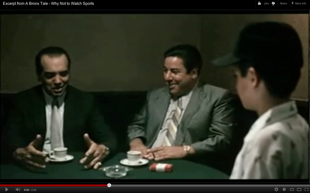
This scene is where Sunni meets Calogero Anello, the young boy.
The tone of the scene is meant to be calm but humorous because Sunni is a notorious man known in the mafia business, Calogero witnessed a shooting that Sunni performed.
The dialogue in the scene is quick and short with small hesitation coming from the young boy, this just conveys some shyness rather than fear.
The background music is from the surroundings where the actors are set, they are in a small bar and the noise is from honking cars and people chattering, this could be to enhance the environment and create a more realistic mood.
From where the scene begins, with the young boy led into the bar by a chubby man, there are subjective shots of Sunni and him done, this is done to emphasise the conversation between them, the shots aren't close up but a medium close up shot. This also helps the viewer concentrate on the conversation between these two characters than being distracted by the background noise.
The lighting is done to be quite natural and lighten up doom lit bar. Certain shots, the lighting is harsh and other areas soft, mainly when the medium close up shots  are done, the lighting is soft, only casting a small shadow on the main subjects faces.
Towards the end of the scene, when the young boy has sat down next to Sunni, a low angle shot is used to add to the type of power Sunni has, and how dominant he can be, the camera is looking up at Sunni and his partner which gives the impression of him being somewhat majestic.

Monday, 5 November 2012

Ming Dynasty (1368–1644)

Just wanted to show where the inspiration of my character's set came about, I am very much interested in Asian style architecture. The structure, the build and design of these ancient buildings have had much thought go into their creation.

It was in this dynasty, that architects built the legendary 'Forbidden City' which has been featured in many Asian fictional books.


Forbidden City, imperial palace complex built by Yonglo, third emperor (1402–24) of the Ming dynasty, Beijing.
Photograph, Palace Museum, Beijing/Wan-go Weng Inc. Archive
http://www.britannica.com/EBchecked/topic/719162/Chinese-architecture/283458/The-Ming-dynasty-1368-1644


http://www.hereisbeijing.com/wp-content/uploads/2012/02/Jingshan-Park.jpg

The Jingshan Park in Beijing, built during the Ming Dynasty during Emperor Yongle's reign.

Nikolay Yeliseyev


http://conceptartworld.com/?p=16664

This is a piece of work from Nikolay Yeliseyev.

  • This work is beautifully coloured, with nice shading done in the background.
  • The composition is small and the image is mainly to do with the female character drawn and the vegetation background to add suitable set for this character to inhabit.
  • A person can identify that this female could be from a Native Indian American background, a Pocahontas style inspiration can also be seen.
  • In terms of the techniques used, this digital painting is done well, the soft strokes and blends work well so not every detail is too worked into.
  • The richness of colour is mainly on the character's clothing, this is a great contrast again the green vegetation and helps to let the character stand out, which could also be taken as a way of translating part of the character's traits. The character from this image looks bubbly, adventurous as she's sitting on a tree branch.
  • This is the type of work that would be used well in games that focus more on the storyline than the actual gaming experience, however, the storyline is also part of a gaming experience.

Trip To Royal Armouries & Leeds Art Museum


Two images from the huge amount of pictures I took for both day trips. These two images mainly helped spark my inspiration for my character in the Archetype brief.
Both are examples of what was worn in a battle, the bottom image gives more detail.

I enjoyed the trip to the both venues, though I feel the Royal Armouries had more items that interested me.

Lost In Translation


Sofia Coppola, director and write of Lost In Translation, mainly set in Tokyo explores how two different types of people have to deal with living in Tokyo and dealing still incorporating their western values into it.


  • Tokyo is mainly known to be as fast-paced as New York City. The movie being set in this city helps to show the viewer how Western people integrate in it and what effect it has on them.
  • Through this fast-paced city, these foreigners try to find themselves and figure out what it is they need to do in life to survive or get through their tough situation.
  • Also the fast pace could exaggeration the characters confusion with the bright lights, skyscraper buildings and busy people, all these could visually stand for dizziness, confusion, agitation.
  • All this are different moods presented in the film, also what the director is trying to put across.

Nathan Crowley


This is the lake house in the movie 'The Lake House', it is the main setting where most scenes were shot.
  • This is an unusual setting used generally in a movie as most movies use effects such as CGI to create more 3D dynamic sets.
  • The storyline is mainly about a relationship that develops in this house.
  • Looking at the image above, the house is obviously situated on a lake but looking at the design, it has a very square-like structure and from the outside you can see how each square helps separate the different rooms. The lake is part of nature therefore it is exposed, could be another reason the house is an all- glass structure and to allow as much space to enjoy the vast scenery outside.
  • The Lake House being positioned in the lake is likely to be an obstruction and hazard to both the environment and inhabitants, but that could be another reason it is an all-glass house so everything is technically see through.

Sunday, 4 November 2012

Arthur Max & Ioan Dumitrescu


These are images from the set of 'Prometheus', a science fiction film that is mainly about the crew on a spaceship in exploration of a godly being.

This movie features a lot of CGI techniques in creating these detailed sets.
  • The set mainly created by Arthur Max was built in depth and also shot in depth. The first image is a room in the spaceship where the crew's planning took place.
  • The second image is the ship they found in a cave abandoned by aliens from a different planet
  • Arthur Max has made a great job capturing a futuristic/alien-like appearance with the surroundings these characters were placed in.
  • He would have had to make the sets look realistic but also unusual as the movie is set in the future.
  • Unlike some movies, these sets aren't meant to evoke any emotional feelings to enhance the character's situation, this movie is more action than drama it has to capture the viewer's attention visually too.
http://conceptartworld.com/?p=16018
Ioan Dumitrescu

To add to this post, this work of Ioan Dumitrescu echoes the set design of Prometheus, it is a drawing of a spaceship interior or platform with glimpses of its outside surroundings. There is a lot of detail in the structure of the ship and the shading is done well, this could easily be used as part of the Prometheus film set.


Saturday, 3 November 2012

Ip Man


The set designer for this movie was Wai Yan Wong.
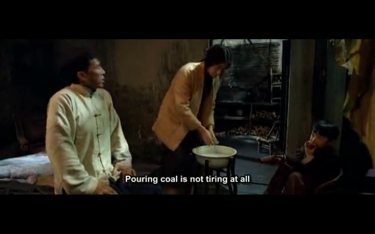
The above images are screenshots from the movie, in the film Ip goes from living in a lavish mansion to a derelict building with tattered walls and broken doors.

There are certain factors that the set designer has used to create these two striking forms of living to depict the situation the family is.

  •  The first image, shows the rich mansion and Wai Yan Wong has placed ornamental items such as vases and plants to convey the richness the family lives in so the viewer can understand how well off the family in the film are. This is a way of projecting this message without bluntly stating it, sort of symbolic. The carpet is another item to consider, it is rich in detail to show it could have been specially made.
  • The second image, shows how the family's situation has changed through the movie, here the walls have no decoration, the family has little possession besides the clothes their wearing, the floor is cold, hard concrete.
Pointing this out is to show that removing certain items or changing the appearance of the set helps to convey part of the movie's storyline because it is another way of conveying a message to viewer without having to say it in the dialogue.
Sets are designed to do this.


Friday, 2 November 2012

Franck Dion ''Monsieur Cok''


http://www.animationblog.org/2012/07/franck-dion-monsieur-cok-2008.html
This animation created through a mixture of 2D animation, paper cut-outs and stop motion is very well done. It is set in WW1 where bombs are made with the engraving 'Cok' on it. The villain likes to take his employees for granted.


  • The animation's main character Barbu is funny without intending to. He comes across as an angry man and does not take to the rudeness that's dished to him in this animation. As the animation progresses, the viewer will definitely find certain parts funny if dark humour is what they understand.
  • There is good use of lighting and shading to add depth to the background scenes, the detail in the drawings are not overly done and the viewer can easily guess the time period its set in.
  • The sound is done perfectly to time, with a mixture of machinery noises and the character noises all brought together to add life to the animation. It is done very well. The angry shouts of Barbu is  constant through the animation, but this helps to build the character and his traits.
  • The storyline has all the right ingredients, a villain and a rival, portraying of these characters are done well because it slows adds bits of information as the animation progresses.

Thursday, 1 November 2012

Set Design: Hero

This movie took place in various areas of China.
http://www.youtube.com/watch?v=LDagtOmhkGo&feature=related

  • The forest scene in Hero is a favourite, because it showcases a beautiful season, autumn. The lighting and shots of the leaves and trees work well together, the characters have also been dressed in red outfits to coordinate with the season.
  • The colours shown are vibrant.
  • The location of this fight scene has been thought through, it takes place in the deep forest where these two are alone and are free to expose their feelings towards one another. Nature itself wants you to be free, so placing these characters in there helps tell the viewer that some action is about to occur in this liberal setting.


http://www.youtube.com/watch?v=vGq6FXcpxtY&feature=related-


  • This lake scene is another breathtaking view in this movie. The injured soldier and his mistress are laying in the middle of the river while mountains and beautiful vegetation surrounds them. 
  • Just as seen above, the outfits these characters are wearing emphasise the scenery around them.
The director has thought it through how these characters move in their environment, and definitely wants the viewer to enjoy the movie's storyline but also its scenes with these amazing locations used. Different shots of the blue lake scene helps show more of its features, such as the amazing reflection of the mountains in the river, also how clean the area these character inhabit is. This helps to emphasise the time period in which this story is set in, in the old periods, people in Asia were closer to nature and used its resources correctly, always putting back in what they took out.


Omer Ben David ''For The Remainder"

http://vimeo.com/36818561

''All the movement, the sinewy grace, of the cat is there but as the screenshot demonstrates, the drawing has the effect of the bare brushstrokes of watery paint, albeit the computer animation is very much in 3D.'' 
(http://www.animationblog.org/2012/06/omer-ben-david-for-remainder-2011.html?utm_source=feedburner&utm_medium=feed&utm_campaign=Feed%3A+animationblog%2FQGna+%28Animation+Blog%29)


This animation that has been drawn using some digital software with wet-like brush stroke settings has been done very well.

  • As  the animation progresses, the soft drawing of the characters are beautifully done, the movement is interesting as the bodies aren't fully drawn in detail but the soft strokes in motion help.
  • The sound in this animation definitely adds that extra life to it, for example when the wave of water hit the spider, it made a sound familiar to a musical glass notation.
  • The storyline is simple, the house cat bids farewell to his home and this animation illustrates its final moment.
  • It is also noticeable how the background is only worked into if it is significant to the scene, which means that the viewer can focus on the beauty of the character drawings and the light strokes used than trying to gather all that is going on in each scene.
  • The swift movement of the animation helps to keep the animation going at a soft pace without any huge action going on, and if there is any huge action, the sound eases the viewer into it.

Artist: Vinod Rams

http://conceptartworld.com/?p=16086

Vinod Rams, a freelance illustrator has multiple pieces just as good the drawing above shows.
This drawing is chosen because

  • there is a lot of detail going on in the image, which is good as it keeps the viewer attentive
  • the action has been centralised in the image so the viewer's eyes direct straight to it
  • the colours used and the simple background add an extra narrative to the image
  • you can tell by the characters in the drawing what the story could be, it seems the man is chasing the woman and she almost got hurt by his monkey pet
Vinod Rams likes to create characters in the world that he would imagine they live in and that can clearly be seen in the drawing, you could call him a fantasist.
The warrior style in the drawing appeals to me, including the fantasical characters in it.


Artist: Maria Ketka Trepalina

http://cghub.com/images/view/125438/


This character created by Maria Trepalina has been amazingly drawn by her.
The character for whatever context it is in evokes a playful emotion.

  • The character big build with a rocky texture creates a contrast with its ribbons as accessories. The red ribbon is a colour contrast to the greyish rocky texture of its body. 
  • The pose adds to the characteristics, its almost as it's been photographed in the middle of dancing
  • The face is not humanlike which is very interesting, and mimics the designs on the body
  • The playful appearance of this character gives it a trickster/magician personality
  • The composition of the drawing does not need to be thought of, however the background completes the character. 
  • The tones/shades added in the character give it a 3D appearance, this helps the viewer relate to it being more realistic
  • The colour palette is a mixture of warm and cool colours that actually work well in this piece.

Artist: Meg Parke

http://megpark.blogspot.co.uk/search?updated-max=2012-04-09T02:14:00%2B01:00&max-results=10

Meg Parke

The image above shows a drawing by Meg Parke, a character designer, animator and illustrator. This work stands out from her other sketches because

  • it has a range of colours used to evoke the wolf's character, which is ferocious
  • the red and dark navy blue create a smooth blend, though a big contrast in both, it works well
  • the proportions of the character aren't realistic but with the torso of the wolf stretched out it gives the character a leering feeling. The hunchback helps evoke that the wolf is a predator, the red tone on the hunchback adds to the ferocious look as red is known for a connotation for danger. So whether the colour was chosen to evoke that purpose it works well. 
This drawing was not done for any specific client, just as a result of making use of spare time.  The materials used to create this drawing is done with Photoshop and a Wacom tablet. The drawing does have a traditional look though its been done digitally.  However, the detail in the wolf's fur is realistic with nice tones and shades to enhance the different poses. 

Tony Kaye vs. Anton Corbijn

Moving Image Analysis

http://www.youtube.com/watch?v=NLWWtgqDG2M


The above link is an advert created by Tony Kaye, Tested for the Unexpected, produced for Dunlop. This short film advert created in the 1993 is ahead of its time. It is suggested that the advert has an arty appearance with highly detailed costume and makeup characters. The bright colours such as the shimmery gold and silver leaves a memorable impression in the viewer's mind. Throughout the video the scenes are striking in the sense there is a lot of activity going on in it. The lyrics of the soundtrack help relate to the video, ''Shiny, shiny, shiny boots of leather''.
The soundtrack also does not take attention away from video's imagery, the sound is psychedelic mixed with drone music, it is also relaxing to the ear which means it eases the viewer slowly into the advert. The lyrics are also re-inforced by the visuals of the video, the bright, shiny colours used such as gold and silver body paint convey these lyrics.
The target of audience the advert is aiming for is probably trying to target a wider range of people than for example mechanical car companies. The artistic appearance aims to strike conversation between people to get them talking about the company for any reason needed.
As seen in the screen capture image above displays the costume and makeup has a futuristic and some mythical characters.
However in comparison, the video 'Atmosphere' created by Anton Corbijn for the band Joy Division.

This video's target audience is mainly aimed at the band's fans because the fans would be able to understand the meaning behind the video. It is a sort of memorial video to Ian Curtis, a band member that committed suicide. This memorial video also fits its function towards being like a goodbye to the deceased singer.
    In the sense of historical factor, this video helps to leave a lasting memory of Curtis.
    The video has features of cultism and religious views with the costumes the people are wearing. In a way the idea of there being a plus and minus sign on the back of the costume could mean joining of forces under any conditions. There isn't much light or colour as the imagery is black and white which helps the viewer to focus on the meaning of the video than the way the colours blend well on screen.
      Viewers watching this video in the present day than when it was created in 1988 would view it as an outdated video because the quality is not there. Whereas, compared to the Tony Kaye's Dunlop advert can still be seen now as relevant to its purpose and be re-used again by the company because of its futuristic imagery.
        The soundtrack to the 'Atmosphere' video is more post-punk with a hint of drone music. The sound is deep and heavy which again sets the mood for the video, since the tempo of the song is slow which is a slight contrast to Tony Kaye's video. Though the 'Atmosphere' video has cultism ideas in it, Tony Kaye's video does not have underlying religious meanings, it does however have some pre-historics tribal characters in it wading in the water and performing dances.
          In conclusion, both videos complete the purpose it was created for.


          Animator: Kazuto Nakazawa

          http://www.youtube.com/watch?v=aVBqauVW2I0&feature=player_embedded#!

          Asience

          ''Blending traditional Japanese tapestry styles with traditional cel-animation techniques, Nakazawa creates a haunting and otherworldly setting for a 60 second story of love and tragedy.
          Fitting the traditional tapestry style, the story follows a Heian-era princess and her samurai suitor. Captivated by the woman’s beauty, the samurai climbs her hair Rapunzel-style to tryst with the princess. Her angry father discovers the truth though and the next time the samurai attempts to scale the castle, she cuts her hair, sending the samurai down, and ultimately herself, in a hail of bloody maple leaves. Her epithet, written in blood, translates as “Hair is the heart of a woman,” an old Japanese adage.'' Jason Sondhi

          First of all, when watching the start of the animation, the viewer does not think it is a shampoo advert unless they've heard of the company 'Asience'. The story interpreted in this animation is not a new idea but the way it has been created and drawn is amazing. It's scenes  are beautifully coloured and using techniques such as composition, bright colours and shading to bring more depth into the scenes.

          • The soundtrack is traditional instrumental asian music, it helps convey the emotions set in the animation.
          • The princess' hair is significant in the animation, and the ending phrase 'hair is the heart of a woman' emphasizes the plot. 
          • The character development is done well, the princess has been given a traditional japanese appearance of what was considered beautiful in the past for women and also having many beautiful leaves in a one of the scenes breeze around her helps to perhaps convey that she is as beautiful as nature.
          • The cherry blossoms help to signify romance in this animation, this is done to send a visual message to the viewer so he/she understands what is going on. This advert leaves a mark in the viewer's mind because the story is mainly about love and tragedy which connecting to women everywhere and they in turn as a result, caring to buy the shampoo.


          Animation: Adjustment by Ian Mackinnon

          http://www.shortoftheweek.com/2008/11/24/adjustment/

          This animation is presented in flip book animation and live action. The storyline goes, Matthew Lyon & Sally Scott are in a relationship, Matthew rekindles his love for drawing and his creativity grows. However, soon this creativity becomes an obsession and he begins to record through flipbooks moment he and Alice have shared, but in reality he is not dealing with the present problems in the relationship.


          • The process in which this animation has been produced is done very well. The scenes in the film switch from past to present similar to a flipbook. 
          • The lesson this animation is trying to put across is that as a person fears losing someone they somehow lose them anyway because their mind keeps living in the past or far into the future.
          • This animation shows are series of flashbacks with techniques such as fading and the gather of multiple scenes happening together which gives the viewer and idea to how frantic the mind of Matthew is.
          • The character Matthew is constantly agitated and worried which shows in his body language presented in the animation.
          • The narrator helps the animation because it gives the viewer another sense to connect with 'sound', so helps to keep the viewer following the story as it plays.

          Photography Induction


          Above are the images I took during my Photography Induction, took the unedited photos in RAW and edited them in Photoshop and exported them as TIF. and JPG. files.
          Hopefully you can see I played with composition, depth of field, lighting and shutter speed. Since doing this induction, I shall start shooting my images in RAW. when I carry out future photoshoots, because the quality is better and when editing them I feel I have as much detail to work with in a the photo that my camera can provide me with.

          Animator: Erick Oh


          Link: http://www.shortoftheweek.com/2012/10/30/heart/
          Screenshot from 'Heart' animation

          ''Erick infuses his heart-wrenching parable with intense action. Soft bodies run, collide, and morph into new forms in a way''
          This animation completely hand-drawn has been produced in an amazing way. The way Erick has drawn his characters using such techniques such as 'squash & stretch' really help bring this animation to life. The characters in this story based on a battle for a love heart have the skill to morph and change which really adds the extra edge to this concept which has been done in the 'Heartstrings'.
          The background is kept simple with shading here and there to add depth to the set.
          What also stands out is the character's facial expressions, the facial features are each unique to each character present but you can instantly tell what type of traits they possess. For example, a few are greedy while some are egotistic. Since this animation does not contain any dialogue between the characters, Erick has used background music to help emphasize the emotions he wants to portray, such as sharp thuds when the action of pulling or tugging is shown.
          He has covered all avenues of trying to illustrate the story and letting the viewer concentrate on the whole aspect of the animation than just characters or colour. Another reason could be why it is mainly in black and white and the heart is one of the objects kept in colour. This keeps the viewer's attention on the heart and help to show that it is a significant item to the story.